Welcome to the October edition of What’s New in ClickStack - the open-source observability stack for ClickHouse. Each month, we combine new ClickHouse capabilities with HyperDX UI enhancements to make observability faster, more intuitive, and more powerful than ever.
This release introduces alerting in ClickHouse Cloud, customizable Event Deltas for greater flexibility, multiline search support, and new dashboard filters for faster investigation. We’ve also enhanced filtering across the HyperDX UI, made Kubernetes dashboards configurable, and delivered another round of performance improvements to keep ClickStack and HyperDX responsive at true petabyte scale.
Building an open-source observability stack is a team sport - and our community makes it possible. A big thank you to this month's new contributors! Every contribution, big or small, helps make ClickStack better for everyone.
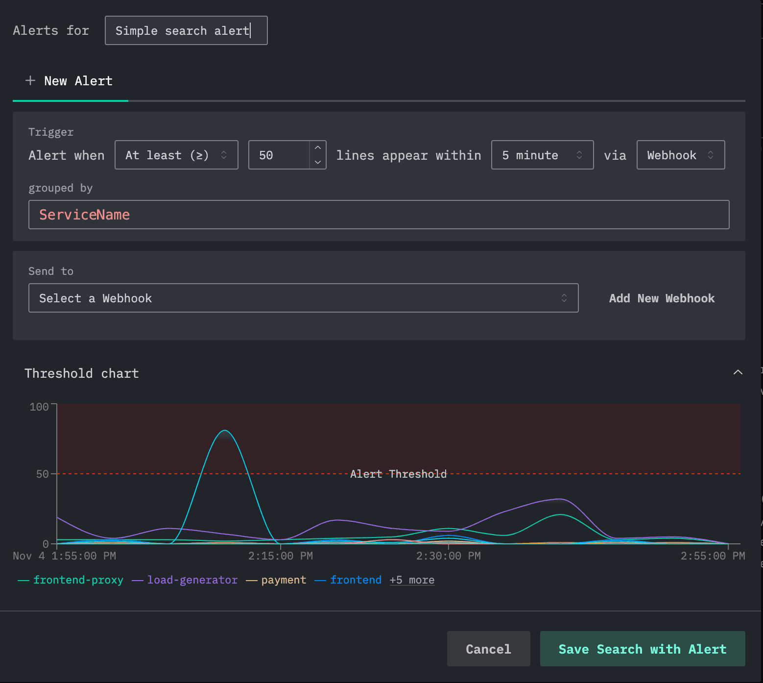
Earlier this week, we announced the arrival of alerting in ClickStack for ClickHouse Cloud, marking a major milestone toward full feature parity with the open-source version. You can read the full announcement here, but in summary, alerting is now available directly in the HyperDX UI, enabling teams to create and manage real-time alerts across logs, metrics, and traces without any custom setup or infrastructure management.
This release brings seamless integrations with Slack, PagerDuty, and webhooks, so teams can be notified instantly about spikes in latency, error rates, or other KPIs stored in ClickHouse. Alerts can be configured as either search-based, using SQL or Lucene queries with thresholds over a defined window, or chart-based, built directly from dashboards with full SQL aggregation support. Together, these options make it easy to go from visualization to proactive monitoring in a few clicks.
Looking ahead, we’re expanding alerting capabilities with additional integrations (including email) and advanced detection logic like anomaly-based alerts. Dedicated compute pools for alert processing are also in exploration, leveraging ClickHouse warehouses to isolate alert workloads at scale.
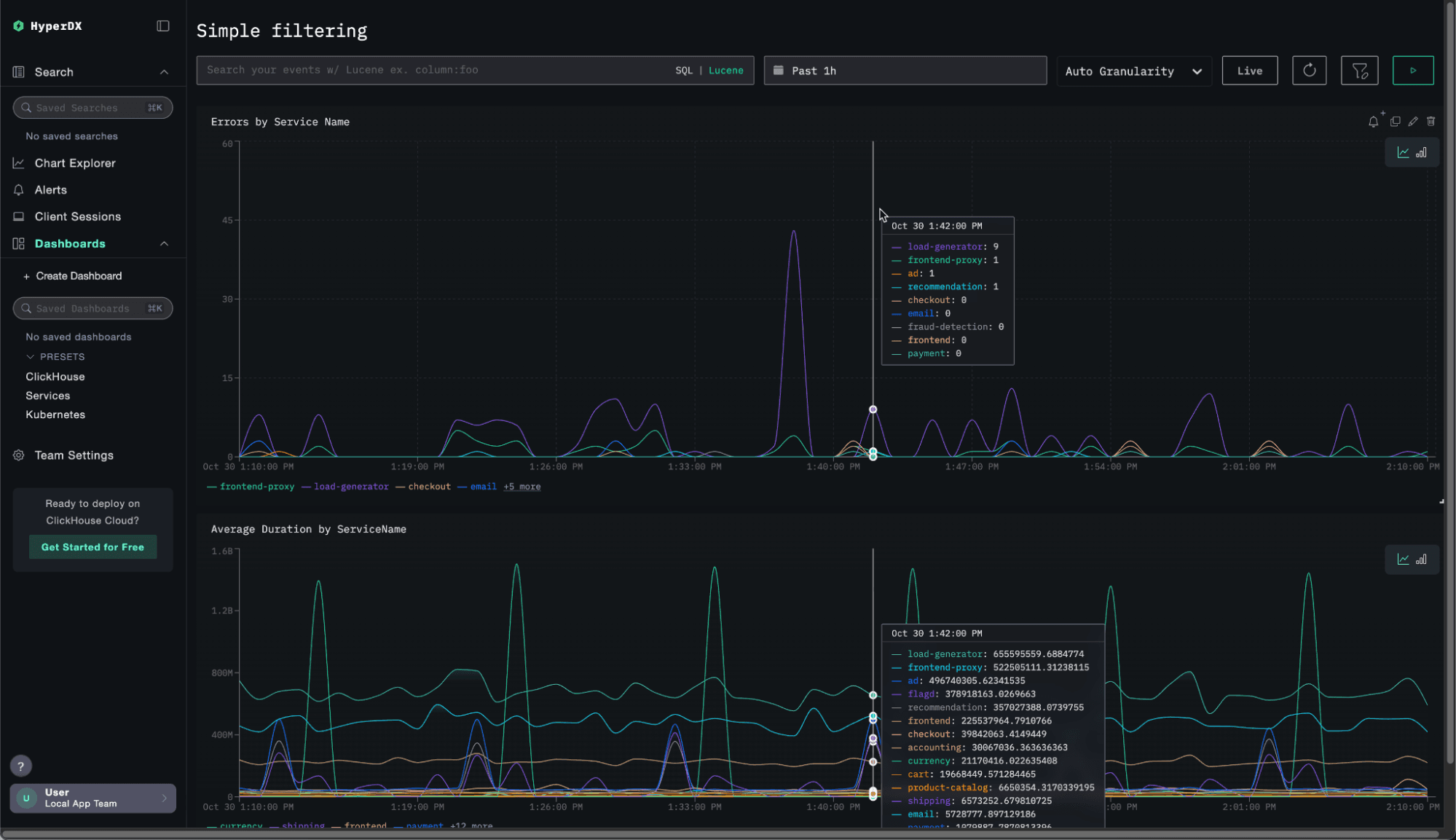
The biggest feature this month is a simple but long-awaited one - dashboard filters. This has been one of the most requested capabilities from ClickStack users, and it’s finally here.
While users could always search within dashboards using SQL or Lucene filters, there hasn’t been an easy way to add custom filters for quick, interactive exploration. We wanted to change that, without introducing the complexity found in other observability tools.
Our goal was to make filtering effortless. No variables, no multi-step setup - just select the column you want to filter by, and ClickStack automatically detects the filter type and creates an intuitive widget on the dashboard. At most, you can give it a label.
The result is a smooth, lightweight experience that hides the complexity behind the scenes. As shown below, adding a filter is trivial. Consider the example dashboard below, displaying errors and latency by service name.
An obvious filter for this dashboard is probably the service name. Adding a filter is simple as we show:
Event Deltas are a unique ClickStack feature that automatically surfaces the reason why certain traces are slower than others. Instead of manually filtering, grouping, and comparing spans to find what’s driving latency, Event Deltas dynamically contrast fast and slow traces to reveal which attributes correlate most strongly with performance regressions.
This helps SREs quickly pinpoint the root cause of outliers - whether it’s a new deployment, endpoint, or user segment. This capability is part of the data exploratory workflows of ClickStack, in contrast to approaches that rely on offline analysis with machine learning models and static alerting.
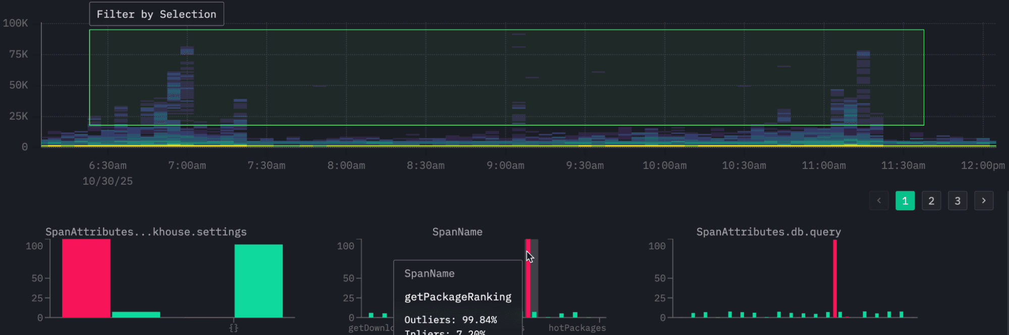
By default, Event Deltas visualize span durations over time using a density heatmap. The x-axis represents time, the y-axis shows duration, and the color intensity indicates the number of spans in each bucket. High-density regions (often yellow or orange) show where spans cluster most tightly, indicating stable performance, while higher bands of sparse color reveal slower spans or performance outliers. Selecting one of these outlier regions automatically triggers a comparison against the baseline dataset, surfacing the attributes most associated with the slower spans - for example, a specific endpoint, version, or user segment.
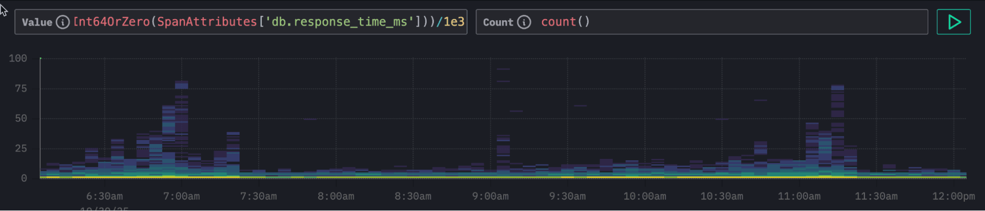
Until now, Event Deltas were limited to analyzing span duration on the y-axis, with color intensity fixed to count. In this release, we’ve added full configurability: users can now choose which field to plot on the y-axis and which metric determines color intensity. This enables far more advanced analyses. For example, exploring relationships between database response times and overall request latency, or visualizing error rates, CPU time, or payload sizes as density drivers.
For example, our public ClickPy demo, which allows users to analyze Python package downloads, is instrumented with OpenTelemetry. Each chart in the application issues multiple queries to ClickHouse. While the overall request duration is captured in the duration column, we are often more interested in the ClickHouse response time itself. High response times might indicate temporary load on the system, but they could also highlight specific queries that consistently run slower.
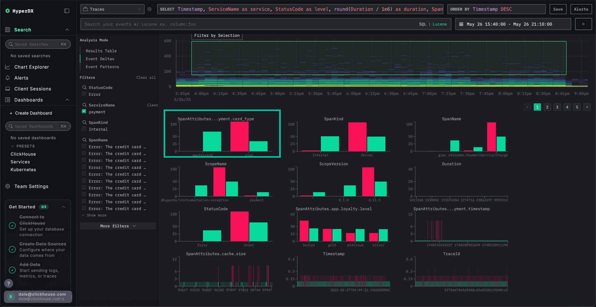
The field db.response_time_ms within the SpanAttributes map stores the query response time. We can now adjust the value column for Event Deltas directly by modifying the expression above the density heatmap. To analyze this String value we cast it to a UInt64, allowing Event Deltas to analyze response time instead of span duration.
In the resulting visualization, we can clearly see periodic clusters of higher latencies. As before, we can select these regions to perform an Event Delta's analysis and identify which attributes are contributing to this pattern.
From our analysis we can clearly see it's one specific type of query that is causing these high latencies connected to the visual getPackageRanking - this computes how a package ranks within the Python ecosystem for total downloads.
Facets in ClickStack show the values available for filtering on each column. Understanding how data is distributed across a facet column is key to fast and intuitive exploration.
The new Filter Percentages feature gives users an immediate sense of how values are distributed for a column within a result set, helping guide analysis and focus attention where it matters most.
Users can now view approximate percentages for each value in a facet, showing how much of the filtered dataset each represents. These percentages are derived from a representative 100,000-row sample using the same efficient sampling method as ClickStack’s log pattern analysis. To keep performance snappy, ClickStack retrieves only the 100 most common values in the sample, assuming the remaining values together make up less than 1% of the data.
Loading video...
The result is a lightweight, high-signal view that helps users build intuition about their data before diving deeper. Whether you’re exploring logs by service name, endpoint, or region, filter percentages make it clear where the largest concentrations of activity or anomalies lie - all within the filtering panel.
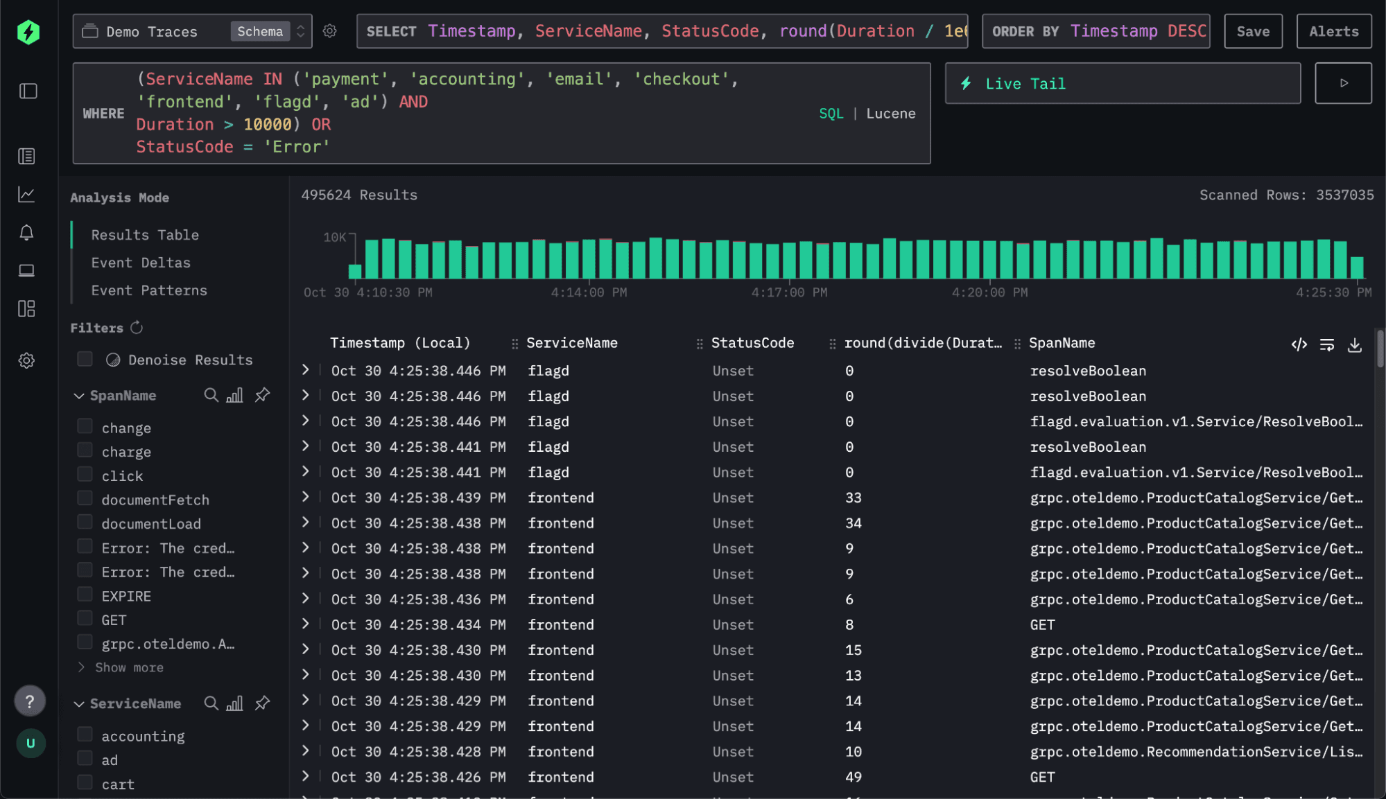
Little things matter. Sometimes, you just need a bit more space. With this update, ClickStack now supports multiline queries - a small but meaningful improvement that makes writing and editing SQL far more comfortable.
While multiline input isn’t common in Lucene search, ClickStack exposes the full power of SQL, where queries often span several lines. Until now, users had to squeeze everything onto a single line, making complex statements harder to read and edit. This simple enhancement removes that frustration and delivers a smoother, more natural query experience.
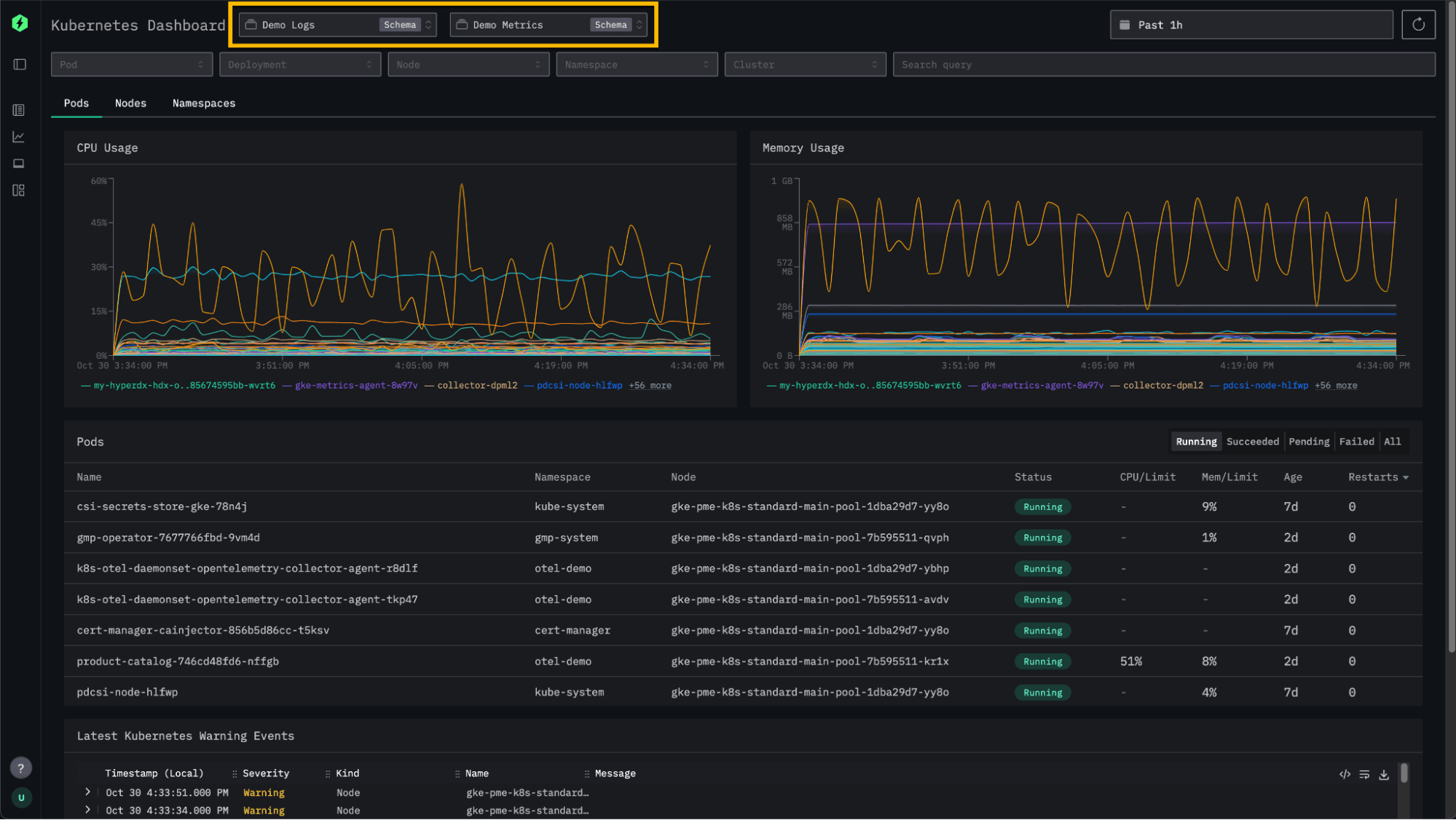
ClickStack has long offered an out-of-the-box Kubernetes experience - making it easy to monitor pods, nodes, and namespaces, and to explore related logs and events. With this release, we’re adding more flexibility by allowing users to configure which log and metric sources power their Kubernetes dashboards.
Previously, the dashboard was tied to the default sources within a connection. Now, users can select any log source, and if a correlated metric source is defined in the configuration, ClickStack will automatically detect and apply it. This enhancement makes it simple to analyze different subsets of Kubernetes data. For example, users often use separate sources and underlying tables for different clusters - whether it be by environment or workload.
Each month, we continue to refine ClickStack’s performance as usage grows across increasingly large-scale environments. With feedback from users running ClickStack at massive OpenTelemetry volumes, we focus on eliminating bottlenecks and improving responsiveness across queries, charts, and dashboards.
Last month, we introduced request chunking for searches. This breaks long time-range queries into smaller segments that execute from the most recent period first, returning results faster and exiting once enough data is available.
This month, we’ve extended the same concept to chart rendering, with impressive gains. Charts now progressively load as data becomes available, reusing cached query chunks across overlapping time ranges. In testing, this reduced total chart-load latency by up to 25%, while average memory usage per query dropped between 18% and 80%. Most importantly, the time to display initial data (the moment you as a user first sees results), has improved by up to 95%, dramatically enhancing perceived responsiveness. These improvements are now available for log and trace charts, with OpenTelemetry metrics support coming soon.
To illustrate this, notice how the chart below incrementally loads once we ask for the visualization over a long 7 day time period.
Loading video...
We also optimized timestamp filtering for data sources that use expressions such as toStartOfDay(Timestamp) in their primary keys. HyperDX now automatically filters on both toStartOfDay(Timestamp) and Timestamp, fully leveraging the primary index. In tests, this change reduced latency by around 25%, with potential for even larger gains in complex filter scenarios. The same function is applied to the right-hand side of timestamp comparisons, ensuring precise filtering across narrow time windows. Together, these improvements deliver more consistent query performance and remove the need for manual timestamp configuration in most setups.
Get started with ClickStack
Discover the world’s fastest and most scalable open source observability stack, in seconds.
Share this post
Subscribe to our newsletter
Stay informed on feature releases, product roadmap, support, and cloud offerings!