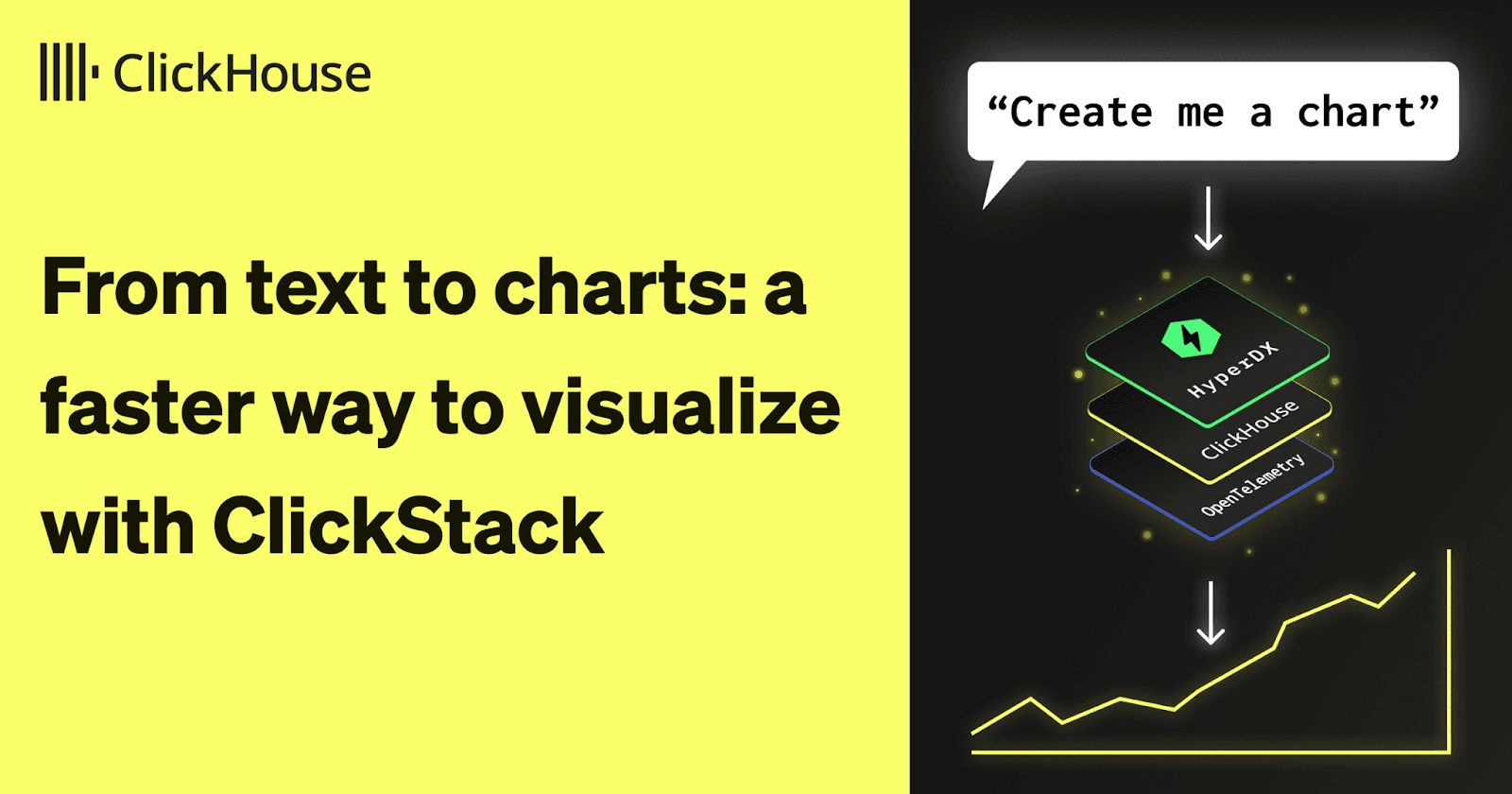
ClickStack's new text-to-chart feature makes analyzing observability data simpler than ever. Whether you're working with logs or traces, ClickStack lets you create charts just by describing them. No menus, no dropdowns - just type what you want to see and get instant visualizations that accelerate your path to root cause analysis.
Over the last year, large language models have started finding their way into observability tools, helping users move faster and spend less time on repetitive work. With ClickStack, we're now bringing that same convenience to data visualization.
ClickStack is a high-performance observability stack that aims to democratize access to ClickStack for everyone. It brings the power, speed, and flexibility of ClickHouse to logs, metrics, and traces - all in an open-source package that anyone can use. This new feature continues that mission by making ClickStack even easier to use.
Describe your chart, and we'll build it #
Want to see error rates by service over the last 24 hours? Just type it out. Need a latency breakdown by endpoint? Describe it, and the chart appears.
ClickStack takes your text prompt, converts this to a query using an LLM, and automatically builds the corresponding visualization. It's fast, intuitive, and designed to get you from idea to insight in seconds.
This kind of natural-language chart generation first emerged in business intelligence tools, but it's now proving just as useful in observability. When you're exploring logs, traces, or metrics, being able to instantly visualize patterns can make it much easier to spot anomalies and understand what's really happening in your systems.
Get started with ClickStack #
Ready to explore the world's fastest and most scalable open source observability stack? Start locally in seconds.
Trying it out #
Enabling the text-to-chart just requires an Anthropic API key. Set the environment variable ANTHROPIC_API_KEY, and ClickStack will enable the feature.
The quickest way to get started and experiment with the feature, is with our local-only Docker image specifying the key via the -e flag.
docker run -p 8080:8080 docker.hyperdx.io/hyperdx/hyperdx-local -e ANTHROPIC_API_KEY='<YOUR KEY>'
Note that this Docker image is intended for quick experimentation, not production use. Authentication is disabled in the local image, which makes it perfect for testing new features but unsuitable for live environments.
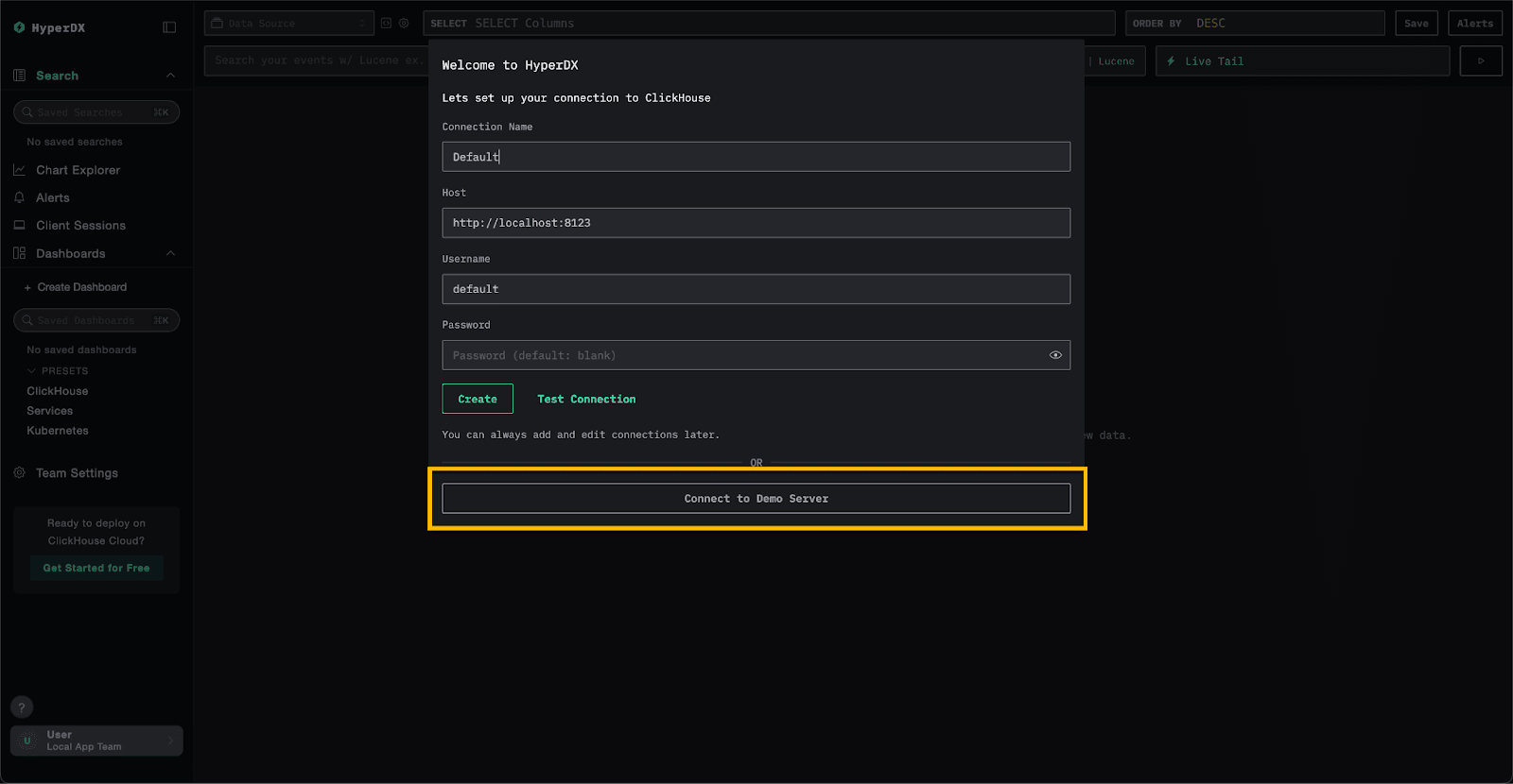
For feature testing, connect to our public demo environment. Launch HyperDX locally at localhost, click Connect to Demo Server and you'll automatically have access to a live stream of logs, traces, and metrics for our OTel demo environment.
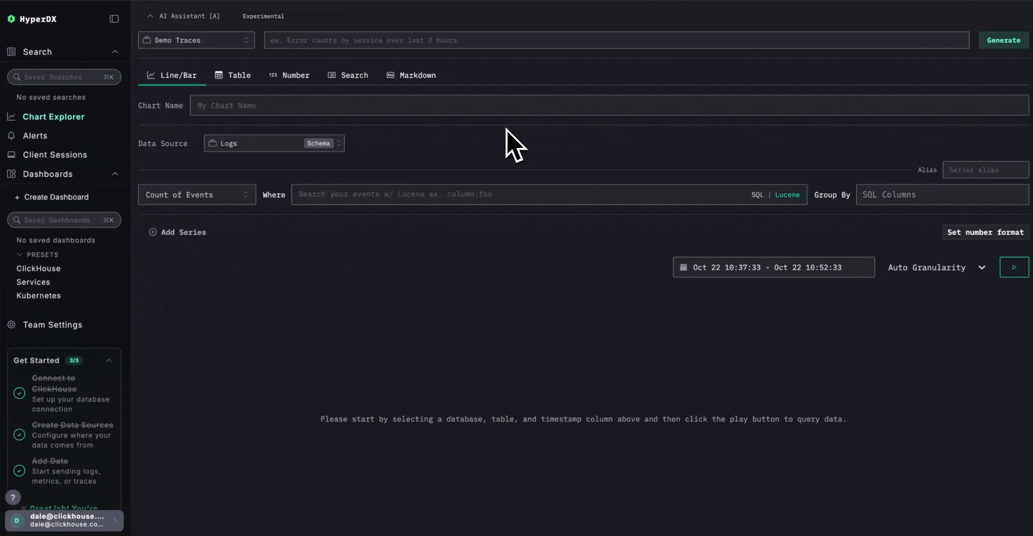
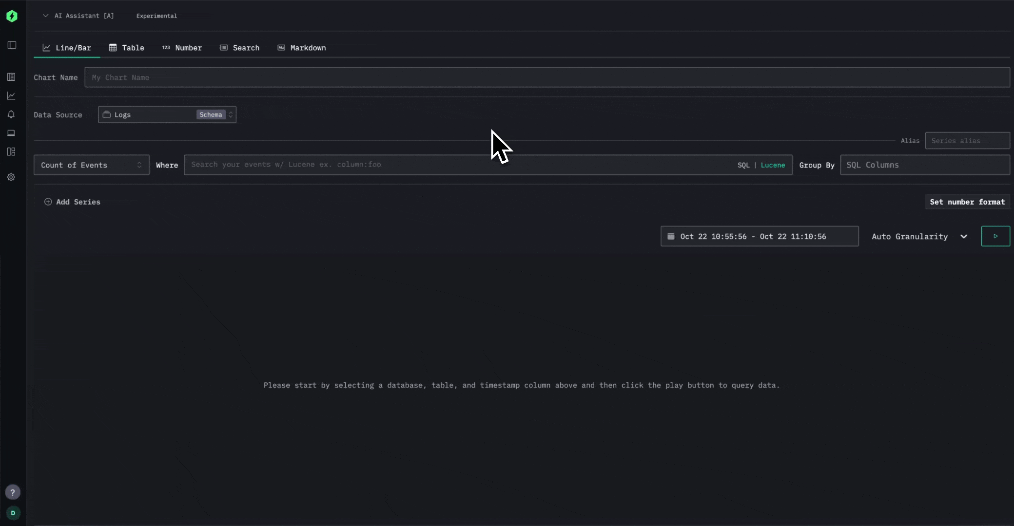
Once you're connected, head over to the Chart Explorer. At the top, you'll find the AI Assistant ready to help you describe and generate charts instantly. Just select a data source and try a few prompts, and see how fast you can go from text to visualization.
In the example below, we generate charts for the logs and traces based only on some simple text prompts.
What's next #
Currently, the feature relies on users having an Anthropic account. Future iterations of the feature will support other LLM providers, including OpenAI.
This is also one of several AI-based features we're building to make ClickStack more intuitive and productive. We're just getting started, and there's plenty more to come that will make exploring your observability data even faster and more powerful.


